1: Base Template
Now that I have a basic blog running with Pelican, I want to start customizing it.
Cleaning the Config
Each Pelican project has a pelicanconf.py file that configures the
site for Pelican. The pelican-quickstart tool used in the previous
entry to create the skeleton for this site generates a configuration
file with sensible defaults:
# -*- coding: utf-8 -*- #
from __future__ import unicode_literals

AUTHOR = u'Jared Andrews'
SITENAME = u'Jared Andrews'
SITEURL = 'http://localhost:8000'

PATH = 'content'

TIMEZONE = 'America/New_York'

DEFAULT_LANG = u'en'

# Feed generation is usually not desired when developing
FEED_ALL_ATOM = None
CATEGORY_FEED_ATOM = None
TRANSLATION_FEED_ATOM = None
AUTHOR_FEED_ATOM = None
AUTHOR_FEED_RSS = None

# Blogroll
LINKS = (('Pelican', 'http://getpelican.com/'),
         ('Python.org', 'http://python.org/'),
         ('Jinja2', 'http://jinja.pocoo.org/'),
         ('You can modify those links in your config file', '#'),)

# Social widget
SOCIAL = (('You can add links in your config file', '#'),
          ('Another social link', '#'),)

DEFAULT_PAGINATION = False

# Uncomment following line if you want document-relative URLs when developing
#RELATIVE_URLS = True
Many of the keys directly map to the questions posed by
pelican-quickstart. The keys LINKS and SOCIAL are not needed for
my purposes so I have removed them. I also updated my SITEURL to
point to localhost. I will need to make this adjustable at some point
so I can deploy my site to a real domain in the future.
Getting Started on a Custom Theme
A Pelican theme requires a certain structure which can be constructed with:
$ mkdir theme
$ mkdir -p theme/templates
$ mkdir -p theme/static/css
After that pelicanconf.py is updated to point to this new theme:
THEME='theme'
Now when the site is regenerated, it is a themeless pile of text with "classic" HTML styling.
The Structure of a Theme
Themes in Pelican are created with
Jinja-2 templates that live in the
theme/templates directory. The structure of the templates
directory can be found in the
Pelican Docs.
I start on building base.html which provides the scaffolding for all
other templates in a theme.
$ touch theme/templates/base.html
Designing the Base Template
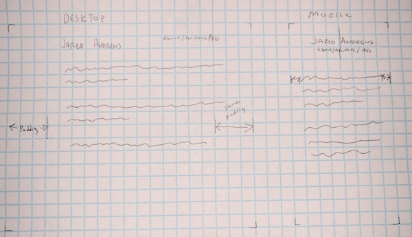
As noted in Part 0 of this series I want the layout of my site to be extremely simple. Not quite as quite as simple as this perfect motherfucking website, but close!
For the header of the site, which will be the primary component
provided by base.html I am only interested in displaying my name and
navigation.
The design I came up with looks like this:
A Quick Aside on Adding Images to Posts
As I use more Markdown tags in these posts I will try to remember to point them out. An image can be added to a markdown file with:

Pelican must be made aware of the location of images. So I
added the following to pelicanconf.py:
STATIC_PATHS = ['images']
Defining the Base Template
Since base.html will be extended by all other templates I need to
include the html, head and body tags. Here is the head tag:
<!DOCTYPE html>
<html lang="{{ DEFAULT_LANG }}">
    <head>
        <meta charset="utf-8">
        <title>{% block title %}{{ SITENAME }}{% endblock %}</title>

        <meta name="description" content="{% block description %}Personal site of Jared Andrews{% endblock %}">
        <meta name="author" content="{{ AUTHOR }}">
        <meta name="viewport" content="width=device-width,initial-scale=1.0">

        <link href="//fonts.googleapis.com/css?family=Raleway:400,300,600" rel="stylesheet" type="text/css">

        <link rel="stylesheet" href="{{ SITEURL }}/theme/css/normalize.css" type="text/css">
        <link rel="stylesheet" href="{{ SITEURL }}/theme/css/skeleton.css" type="text/css">
        <link rel="stylesheet" href="{{ SITEURL }}/theme/css/jaredandrews.css" type="text/css">
    </head>
    <body>
        <!-- TODO -->
    </body>
</html>
Despite the file extension, I am now working in Jinja-2 and html.
Blocks like {{SITENAME }} and {% endblock %} are processed by the
Jinja2 Templating Engine when the site is
generated.
Jinja2 provides a
DSL for defining templates
in a python-like language. Pelican provides
a list of variables that can be accessed for each templated page. Variables
defined in pelicanconf.py can also be accessed by any template.
Some important parts from above:
<title>{% block title %}{{ SITENAME }}{% endblock %}</title>
{{ SITENAME }} prints the SITENAME defined in pelicanconf.py. By
surrounding {{ SITENAME }} with {% block title %} ... {% endblock %}
I am allowing templates that inherit from base.html to override the content of {% block
title %}. This will become important when building the other
templates that extend base.html and want to change the title shown
in a browser's title bar.
        <link rel="stylesheet" href="{{ SITEURL }}/theme/css/normalize.css" type="text/css">
        <link rel="stylesheet" href="{{ SITEURL }}/theme/css/skeleton.css" type="text/css">
        <link rel="stylesheet" href="{{ SITEURL }}/theme/css/jaredandrews.css" type="text/css">
The above code imports a few css files from my theme/assets/css
directory.
I am using Skeleton as the only CSS
"framework" for this project. Skeleton provides a nice set of
responsive styles for desktop and mobile. Skeleton asks that you
import normalize.css as well.
Then there is jaredandrews.css, this file will contain any
additional CSS the site needs.
Next is the <body>:
<div class="container">

    <div class="row header">
        <h1 class="site-title"><a href="{{ SITEURL }}">Jared Andrews</a></h1>
        <nav><a href="#">about</a> / <a href="#">archive</a> / <a href="#">rss</a></nav>
    </div>

    <div class="row">
        {% block content %}{% endblock %}
    </div>

</div>
The first <div> has container as its class. This is the root
element for a Skeleton layout. Skeleton will center this div on the
page.
The second <div> has a class of row and header. row is another
class provided by Skeleton. It basically indicates that the selected
<div> lives on a row in the Skeleton grid. header is the class
that I will use to define the movement of the title and navigation
between mobile and desktop.
Using CSS to Adjust the Header
To get started with jaredandrews.css I add:
/* Default and mobile */

/* Larger than mobile */
@media (min-width: 400px) {}

/* Larger than phablet */
@media (min-width: 550px) {}

/* Larger than tablet */
@media (min-width: 750px) {}

/* Larger than desktop */
@media (min-width: 1000px) {}

/* Larger than Desktop HD */
@media (min-width: 1200px) {}
Skeleton recommends using this set of media queries in your custom css. Anything defined outside of a media query will both be the default CSS for an element and what you see on mobile. Media queries are then provided for larger screens.
For the default/mobile style I want:
.header nav {
    display: block;
    text-align: center;
}

.header .site-title {
    margin: auto;
    text-align: center;
}
These selectors center both elements and put the title above the navigation.
Next I want to handle "larger than tablet" devices. I want the title to be shown on the left side of the screen and the navigation on the right.
/* Larger than tablet */
@media (min-width: 750px) {
    .header .site-title {
        float: left;
    }

    .header nav {
        display: inline;
        float: right;
    }
}
Now the layout of the header reacts to the type of device it is being viewed on.
Wrapping Up
At this point I have a nice looking site. I plan on tweaking
everything else, but just by providing the base.html
template I can see huge changes to the way the site looks.
To view this site the way it looked once all the changes described in this article were made, click here.
Commit on GitHub.