2: Index Template
Now that the base template has been created I want to design the front page of the site.
Designing the Home Template
In keeping with the overall "minimalist" vibe I only want my home page to be a list of posts. Right now, with the default template provided by Pelican, there is a list but there is way too much information.
I want something more like:
> Name of Post (Feb 4, 2017 / making-this-site / programming, web-dev, pelican)
Laying Out the Index Template
The front page lives in index.html:
$ touch theme/templates/index.html
First I inherit the base template:
{% extends "base.html" %}
Then I make an unordered list to show the articles:
{% block content %}
<ul>
{% for article in articles_page.object_list %}
<li>
<a href="{{ SITEURL }}/{{ article.url }}">{{ article.title }}</a>
 
<span class="post-meta">({{ article.date.strftime('%b %d, %Y') }}
{% if article.tags %}
/
{% for tag in article.tags %}
{% if not loop.last %}
<a href="{{ SITEURL }}/{{ tag.url }}" rel="tag">{{ tag }}</a>,
{% else %}
<a href="{{ SITEURL }}/{{ tag.url }}" rel="tag">{{ tag }}</a>)
{% endif %}
{% endfor %}
{% endif %}
</span>
</li>
{% endfor %}
{% endblock content %}
The most important part of this is the for loop on
line 3. articles_page.object_list holds a list of
articles to be displayed. I use this to add info for each article to
an <li> element.
Some CSS Refinement
The freshly added template looks almost exactly how I want it. But there are two issues from my perspective:
When I am in the mobile view the metadata for each post looks awkward:
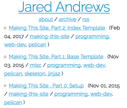
There is no space between the title and the first article in the list:

Making Metadata Great Again (on Mobile)
I put each articles metadata in a span with the class post-meta.
So I can define post-meta in the "default && mobile" section of
jaredandrews.css like so:
.post-meta {
    display: inline-block;
}
This change makes entire span jump to the next line when any part of it can't fit into the parent container:
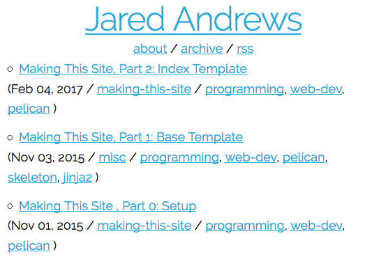
This is better but I don't like how the metadata falls underneath the
bullet point. Instead I would like it to align with the post title. To
achieve this I add the following to the "default && mobile" section of jaredandrews.css:
li {
    list-style-position: outside;
    margin-left: 1em;
}
Sick!
Creating Space Between the Title and the List
Next I want to make a little bit of space between the header and the
list. By default Skeleton assigns a bottom margin of 2.5rem to most
elements. I am going to give my header div the same margin by
adding:
.header {
    margin-bottom: 2.5rem;
}
A Quick Aside on Improving Image Display
While I intended to focus strictly on index.html in this post I
noticed how bad the images were looking while proofreading and
wanted to do something about it.
First the images don't respond to the width of the screen at all meaning they bleed off the page. Second, the images have no border, which can cause confusion, especially when displaying screenshots of text from this site.
To add a border and make the images scale I added the following css
to the "default && mobile" section of jaredandrews.css:
img {
    max-width: 100%;
    box-shadow: 0 2px 4px 0 rgba(0, 0, 0, 0.2), 0 2px 8px 0 rgba(0, 0, 0, 0.2);
}
This makes the images stay within the width of the screen and provides a nice border with a shadow.
Wrapping Up
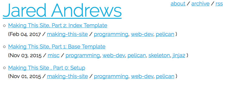
I now have a home page that looks exactly how I want it.
To view this site the way it looked once all the changes described in this article were made, click here.
Commit on GitHub.